Yes I'm inspired by the skull trend still very strong in fashion, decor and accessories but it's also that time of year when I'm thinking creepy things. So I was inspired to combine that theme with a past successful Ferrochie product, the wooden comb!
The Design of the comb is a simplified Victorian curve that rolls into an oval hold for the thumb and forefinger. The size is smaller than any of my previous combs (3" Square) to make it small enough to slip into any purse, handbag or pocket. There are 12 tines at 1/8" spacing for a nice broad and smooth stroke.
The Front Art is a rendition of DaVinci's medical sketch of the skull from his sketch books. Always being a huge DaVinci enthusiast I immediately wanted to go there with this skull. For size comparison the skull measures 1" tall on the comb. I inset the skull within an oval frame to give it a sort of cameo appearance. Lastly I added some creepy scrolls to create some drama in the space above the tines.
The Rear Art features the same oval frame and scrolls but inset are the Ferrochie makers mark and the series number. Since this is technically my prototype or as us manufacturing nerds like to say "First Article Sample" it features a "0" or naught above the mark. This particular one will never be sold and kept in my personal archive. The one's I will be selling will be numbered 1 thru 13 in a limited series and not made again.
Why Would I Want a Wooden Comb? Well there is a bit of nostalgia involved with wooden comb ownership but for practical purposes there are really only two.
#1 - No Static! This is big and speaks for itself.
#2 - Impress your friends with a cool limited edition comb in your bag that only has 12 siblings!
Make no mistake this comb can be actually used! I had so many people think my past combs were for decorative purposes only. Of course, you're more than welcome to protect it as a keepsake since it's definitely that if nothing else but do use it.
Details of how to get one of your own will be announced soon on FB and Twitter. Happy Friday!
Friday, October 4, 2013
Friday, March 1, 2013
Artistic Endeavor's
![]() |
| William Shakespeare |
The image to the left is a sample I created during these past few weeks of trying to perfect the process. I realize now what must be done within the artwork to really pull the detail needed to truly be special. So, I'm smack in the middle of creating my own art for use in this unique process. I look forward to sharing those with you.
![]() |
| Edgar Allen Poe |
Monday, November 26, 2012
2013 Trend #5: The Glass Cloche
"When it doubt, put a cloche on it!"
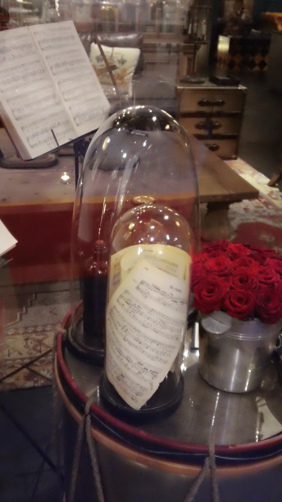
With what I am seeing out there you can use that motto whenever you are unsure or want to accent something in your home. The cloche is popular because of it's amazing ability to put something that would normally be out of context into one. Just like it's original "functional" purpose, you can put just about anything inside and shield it from it's surroundings. Put anything from a creepy doll head to a stapler inside a cloche and voilĂ ! It works with your decor!
Many versions of the cloche are available and I've never see them more popular than then are right now. Particularly, with the emergence of another trend (next post) that is a natural for the cloche. In fact, this surge in cloche use may be a direct result of that but still, the cloche deserves respect on it's own.
A recent HGTV Magazine issue showed a clear glass jar with cute little note cards inside. In addition to being a fun holiday activity it also demonstrates the influence the cloche is having in other ways. Clear glass containers, terrariums and cloches are all part of the same family doing essentially the same thing in different ways. Taking objects or items and giving them some visual context. If you wanted to utilize this in a more home & hearth type decor you could do clear glass mason jars filled with something interesting for instance.
Go ahead and experiment with this in your home and in your art work. Play with the elements of it too like the clear glass. So many of these things are interconnected it's very easy to make your own interpretation and still be on trend.
Next Trend: Victorian Science, Specimens & Skulls
With what I am seeing out there you can use that motto whenever you are unsure or want to accent something in your home. The cloche is popular because of it's amazing ability to put something that would normally be out of context into one. Just like it's original "functional" purpose, you can put just about anything inside and shield it from it's surroundings. Put anything from a creepy doll head to a stapler inside a cloche and voilĂ ! It works with your decor!
Many versions of the cloche are available and I've never see them more popular than then are right now. Particularly, with the emergence of another trend (next post) that is a natural for the cloche. In fact, this surge in cloche use may be a direct result of that but still, the cloche deserves respect on it's own.
![]() |
| HGTV Magazine |
Go ahead and experiment with this in your home and in your art work. Play with the elements of it too like the clear glass. So many of these things are interconnected it's very easy to make your own interpretation and still be on trend.
Next Trend: Victorian Science, Specimens & Skulls
Saturday, November 10, 2012
2013 Trend #4 : Humanized Animals & Stencil Forms
![]() |
| Illustrations of Animal Heads on Human Bodies |
Not that this is a new art form but this emerging trend has some clearly defined rules. The examples I found at both trade shows and in my retail explorations had a genre focus on those all to familiar portraits from the middle ages up. To me they appear mostly to resemble renaissance portrait paintings with a dark, serious and at times almost menacing appearance. Except rather than a bunch of bourgeois rich guys who want to commission paintings to show status, we've been replaced by the Animal Kingdom's royalty and middle class.
![]() |
| Emeowly Bronte by ChetArt |
I couldn't help but immediately think of my artist friend Chet Phillips of ChetArt who has been working this genre for years. If I want to get in on this trend in earnest I need look no further than his website which features literally hundreds of his original works. If you are thinking about exploring this art form I would certainly suggest exploring his website. He's such an amazing artist that I hope this trend will increase his exposure now that it's hitting the mainstream.
It's a bit early to tell on this one but I hope this sticks for a while in this form or another. Historically with trends like this it will mutate quickly and when it does it will be interesting to see where artists take it.
Stencil Forms
![]() |
| Stencil Bear (Note: Goat Men in Back) |
Outside of this particular use of laser cut stencils there has been for years quite a few products in lighting and other trades doing a form of stenciling. In fact, in a recent October edition of HGTV magazine, one of dozens of such products was featured. (see below) I don't know if that's just coincidence or planned timing but this one will have to be watched as well.
Since I just invested in a laser cutter I suppose I can toy with this trend too. The hard part is figuring out which trend to work on first. :)
![]() |
| Left: Moose Stencil | Right: October 2012 HGTV Magazine |
![]() |
| Ostrich & Antelope |
Thursday, November 8, 2012
2013 Trend #3: Birds Today, Horses Tomorrow
![]() |
| Birds used in various decor applications. |
![]() |
| HGTV Magazine October 2012 |
Looking to your right at the October HGTV magazine image of David Bromstad cheerfully discussing art you might be thinking, "Hold on a sec! What do you mean birds are trending? I've been seeing owls everywhere for years!" Well, that's true. Owls really never go out of style and have been cyclical in popularity. This bird trend is much broader than owls but does include him nonetheless. Bird trend gets a mention in the caption and David's designer owl wallpaper was on the opposite page.
![]() |
| Elle Decor October 2012 |
For designers and artists it's a perfect time to try working with birds in your products and art work while it's on the top of the trend curve. For decorators, it's a perfect time too since there are already so many items to choose from. Birds will be with us for awhile so you have some time.
Alternatively, if you like to live a little on the edge and in front of the curve there is something else bubbling on the horizon. Horses are starting to pop up here and there as well. I have seen it both in person at the trend shows in Paris as well as in retail. Right now it's subtle sporadic uses as small accents here and there. Almost as if to plant subliminal mental impressions for a ramp up to 2013 or 2014. The most blatant use I have seen were these horse head sculptures placed in a grouping of four. Horses are beautiful creatures and I'm confident this will pick up steam. I'll be keeping a watchful eye on this one though the next year. Again, if you like horses I don't think you would be wrong to go ahead and jump on this one without knowing if it sticks.
![]() |
| Ballard Designs October 2012 | Note the horse painting. |
Wednesday, November 7, 2012
2013 Trend #2: Vertical Lines
![]() |
| Vertical Line Pendant Lights |
This particular emerging trend has all the earmarks of being a flash in the pan expression of something different. Artists and designers will need to take it as inspiration and build upon it in order for it to have real staying power. There are however some great examples supporting this trend in trade magazines that lead me to believe it has a real shot at hanging around.
I would characterize this trend as any object whose form is defined by a series of vertical structural elements. Usually having few or ideally no horizontal support through the center. Many examples I have seen so far involve lighting and tend to lean towards the contemporary. The inherent visual qualities and rhythm of a vertical line structure almost force it towards modern but there are some softer examples. The image in the upper right is a nice attempt at a casual interpretation but then consider the hard contemporary lines of these fixtures below.
These images are indicative of what I have been seeing but if this takes off I can easily see many applications for more transitional and traditional pieces. In fact, I am playing around with this concept myself. I'll reveal later! :)
At the same time I was observing this trend in Europe small examples were popping up in October editions of House Beautiful and Elle Decor. Again, that suggests it has some support and credibility in the broader community or at least they are trying to get it to catch on.
I'll be keeping a watchful eye on this over the coming months to see how it grows and evolves. Maybe you can take some inspiration from this in your own work or your own decor. Try something different or unique with it. Either way it's making people think.
Next Trend: Birds
![]() |
| House Beautiful | October 2012 |
![]() |
| Elle Decor | October 2012 |
Tuesday, November 6, 2012
2013 Trend #01: Nature Inspired
| Large Branch Sculptural Lighting |
Large Branch or Driftwood
This is a new direction moving away from the smaller thin twigs and bunched grasses of only a year ago. In these new forms we can see thicker, meatier interpretations. Most examples both at shows and in retail are knurled and twisted as if found on a creek bed twisted and bleached by the hot sun.
Below is an example of a more artistic use of the trend. It also plays within the even more broad Ethnic Chic trend with it's primitive hut motif. I ate a lunch inside one of these huts. The hut was great, the sandwich failed to impress. :)
![]() |
| Large Branch Driftwood Huts |
![]() |
| Bundled Wood |
![]() |
| Distressed Wood Collage |
Last year this was all over table tops but instead of the bleached color pallet your see on the left it was more colorful and distressed. Before, it would have appeared as though you tore down an old barn side that had a 50 year old billboard painted on it, cut it in little pieces then randomly pieced them together for the collage. Today, the distressed colors have been abandoned for the cool greys and whites of the bleached look. This seems to be the new interior color palette a la Restoration Hardware. However, don't worry color lovers! Bold pop colors are being used to inject a little spice into these spaces. But that's a post for another day.
Coming up next: Vertical Line Trend
Monday, November 5, 2012
Maison & Objet | Trends in 2013
| The Hemingway Pose |
It is in the Cafe Panis nestled on a corner between the Shakespeare & Co. bookstore and the Notre Dame that I took this self effacing photo. (Yes, that's a joke. The self effacing part anyway) :) Paris is so inspiring and I'm so privileged to be able to travel there each year to study trends. To not share the information with my friends would be unforgivable. Besides, keeping a trends to yourself is the fastest way to destroy it. It needs to be known to grow and thrive! So, without further ado . . . the trends!
Sunday, June 10, 2012
My Visit to Dafan Art Village in Shenzhen
![]() |
| Dafan Art Village Entrance |
As we approached the area a large hand with brush sculpture (left) invited us to enter the artists coven. Other sculptures were scattered around a small garden reminiscent of the Venus De Milo with accompanying quasi Greco Roman architecture. Once you pass this area you begin to see the more familiar scenes of Chinese communities (below). Rows and rows of merchant streets with small alley ways bisecting them.
![]() |
| Dafan Art Village Street |
![]() | |
| (left) Dafan Alley | (right) Inappropriate Sculpture Arrangement |
The genre's on display do vary but the two very dominant one's were classical Asian and European reproductions. If you have the time (as I did) you can sort through the stacks and stacks of canvas and pull out the gems. You can haggle too of course. I got all of these (below) for $27.00 USD and I probably could have got them even cheaper if I was an ass. I haggled on quantity and started to haggle on the larger canvases and then I put things in perspective. I couldn't get one of these small one's for $27.00 back home so I'll give this guy a break. Plus, he let me use his bathroom which is a story for another blog entitled, "Places You Can Go To Feel Better About Your Life".
![]() |
| All Of These For $27.00 USD |
The last cool little things I want to note is you can get one of these artists to do an oil of any picture you can supply. So if you want an oil of your daughter, your dog or yourself you can drop off a picture and come back in a few days to get your painting. Personally, I've always wanted a really obnoxious 19th century painting of myself in Scottish Military Regalia (Right). It would have to be in my Lamont tartan though and I would add a loyal West Highland Terrier too. I can picture it now hanging above my mantle where I can stare at myself until I grow old. Next, trip . . . it's happening!
Next Sunday before I head back home I think I'll try another enclave that's rumored to have jewelry and stones. I can always use some raw material for my work and I have just the thing in mind if I can find good stuff.
Saturday, June 9, 2012
Midnight In Paris - The Part Critics Missed
![]() |
| Midnight In Paris |
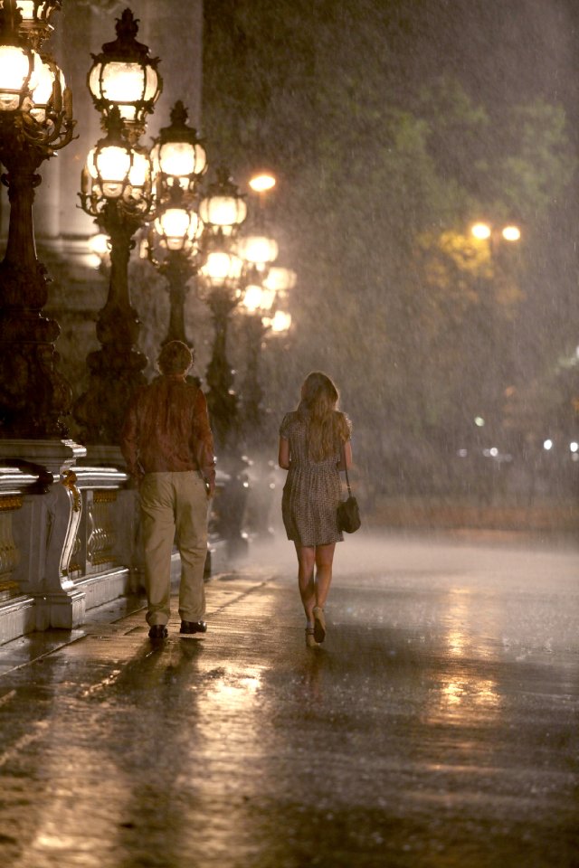
What I'm referring to is about nostalgia, what it says about you and how we use it as a coping mechanism amongst other things. In the film the character played by Owen Wilson is a writer who loves Paris and has a bunch of literary heroes with associations to Paris. As a result, he has nostalgia for the circa 1920's time period that he's teleported into. He's taken by how amazing it is to hang out with Ernest Hemingway, F. Scott Fitzgerald and a horde of other famous characters he has admiration for. As the meetings continue night after night he's able to discover things about himself that he had been avoiding or having trouble coping with back in his own time. You start to get the idea but the point gets driven home when he begins to fall in love with Adriana a character played by Marion Cotillard. On their first date in 1920's Paris they get transported an additional 50 years back to a time that Adriana had a deep nostalgia for. In a brief exchange they argued over which time period was better 1870's Paris or 1920's Paris. She hated her time period and insisted life was better and more interesting before. He argued the same point but coming from the present to the 20's. At last the epiphany revealed . . .
"Life sucks. We just sometimes choose not acknowledge it sucked before."
Born in the wrong time we say. For example, the romantic notion some women I know have about the Victorian Era or even Medieval Europe. Gorgeous dresses, grand balls, proper Gentlemen, etc. We are all aware this is a very slender view of the total picture and highly romanticized by modern media. Regardless of that knowledge we still like to imagine ourselves happier if only we lived in that time. We do this without regard for the fact that women were subjugated, more likely to be born poor and might very well contract a host of horrible disease because there wasn't any penicillin around.
I'm guilty. I've blogged before about my heroes and frequently pressure myself to live up to their standards. I've even attempted to use modern day challenges as an excuse for why I'm not further ahead when the reality is that my heroes struggled too. In some cases, they died unfulfilled and unaware of the real impact they had on the field or future generations.
So what the movie had me thinking about was nostalgia can be a good thing provided it doesn't hold you back. In the movie he had to come to this realization in order to move forward in his own time and reach his full potential. Secondarily, it had me thinking that perhaps I standing shoulder to shoulder with tomorrow's hero's. Many of my talented colleagues and friends may very well be in design tomes 50 years in the future but you can never imagine it. You just get caught up in the work. I can already picture future designers talking about how awesome it must have been to be a designer during the digital revolution. Things were probably a lot cooler then they they are now. Perhaps but we were all so busy working, climbing, struggling and living life in general to notice. Same as every generation before us.
Midnight In Paris made me think about it. And I'm better off for it.
Saturday, June 2, 2012
Have I Made My Last Oberon's Gateway?
![]() |
| Oberon's Gateway |
![]() |
| 2nd Annual Etsy Spring Bash May 2010 |
So why discontinue it? It's the keys! I just took an order yesterday that will consume my last set out of those beautiful vintage keys imported from France and I don't think my supplier has anymore. These keys MAKE the item and if I can't get any more it's a death sentence for OG and his mate Titania's Rapture. I suppose that only makes them more desirable in a sense. I'll know by the end of the month if it's over for this product and if it is . . . thanks for the memories!
Saturday, February 25, 2012
How To Make A Splined Joint
![]() |
| Two pieces of solid pine. Note the FSC certified label! |
![]() |
| Sketch of a "Splined Joint" |
To start I set up a box end bit into my router table. The depth I'm going with is around 5/16" to give the spine enough grab when it nests into the groove. This is of course completely optional and up to you the depth you feel is necessary. This is one of those things you can play with and find what works.
Next, I offset my fence to be "in the ball park of center" being perfect doesn't matter as long as you keep track of the up and down side of the panels. You can lay them flat on your workbench and look for an offset. If you see one just flip on of the two panels over so they align. Once you have run the two panels through they should look something like the image to the right. Note: Please don't disable your guard on your router table. I'm not your mom but we need more craft in our world. You'll contribute more if you keep all your fingers. I'm simply holding my guard back for the photo.
To make the spline itself run another piece of wood through your router setup but adjust you bit depth to twice the size. This should equal the width of the spline you need. For the part I chose a smaller 6" wide piece I had in my stock just to reduce waste and make it easier to handle. Set the fence and blade height to trim off the lower edge of the router cut (left). If done correctly, you should be left with a perfect spline insert (see inset on left). If not you may need to adjust and rerun the board but it should be very close the first time.
The last step is to glue it up and clamp it (see right). Run glue into the channels of both panels. I like to puddle up some glue on a scrap piece and use my fingers to butter some glue onto the surface areas that will be joined too. This will result in less glue waste and more importantly less glue seeping out of the joint onto the panel surface. Believe me, this will cut down on sanding time for you later. Clamp it along the width first (orange clamps) using bar clamps to pull the joint together. Next, use some lengthy scrap wood to clamp down the ends (blue clamps). This will keep the two panels parallel and flush during the drying. It is important to make sure no glue is seeping from the joint before this last step. Otherwise, you'll have an unwelcome additional wood block permanently glued to your new panel.
After 24 hours drying you'll have a super strong extra wide panel to do with what you will. I'll follow up later with what I did with my splined joint panel.
Tuesday, January 24, 2012
Illuminated Manuscripts
![]() |
| Illumination from the Book of Kells |
Illuminated manuscripts fell into decline with the advent of the printing press but is still being practiced by artists all over the world on Etsy. I put together a quick treasury so you can see some of the work being done.
http://www.etsy.com/treasury/ODk4OTgzNXwxOTE2ODUwMjg1/illuminated-manuscripts-lettering
I have always loved this art but took a particular interest after realizing it was perfect for a new project Misty and I have been working on. However, illuminated letting isn't something you just decide you want to do one day and it's perfect. It's very involved but you can start learning by taking one small step at a time. If you are up to the challenge there are a couple websites out there that can give you a head start. Here is one of them.
http://www.gold-vault.com/gilded_manuscript.html
There are many techniques to creating illuminations so research and experiment. That's what we are doing and I think we have a technique that is working for us. We will soon see in the final product in a few weeks.
For more info definitely check out wikipedia's entry. It has a lot of great information and external links: http://en.wikipedia.org/wiki/Illuminated_manuscript
Friday, December 16, 2011
Are you too trusting with brands?
![]() |
| Reclaimed Pressure Treated Lumber |
Trust in our manufacturer's is something a lot of us take for granted. I do everyday! Even in the wake of some pretty serious problems like the not so distant Melamine laced baby formula and lead painted toys. So why do we do it? I don't have that answer because I'm not a psychologist but there is something you can do about it. Ask more questions! Ask companies where they manufacture. If it's off shore ask them where? Where do the materials come from? Are they sustainable? Who's making sure it's safe?
Asking yourself these questions will put you into a different mindset when you look at packaging labels on consumer goods. Much in the same way we are retraining ourselves to look at food labels. Consider that when companies talk about building consumer trust it's almost always based on marketing ploys or gimmicks. Here are some hit points from two different blogs about building consumer trust.
1. Stop being a cold impersonal business and start being a warm, personable business.
2. Be truthful.
3. Spell out your guarantee.
4. Make it easy for customers to complain.
5. Build on your successes.
None of those points have anything to do with ethics or doing the right thing. I'd be impressed with "Be Truthful" but it's about being truthful in advertising. FAIL!! Besides, all of those points made should be a standard part of doing good business. That fact that people in business have to be reminded of that makes me cringe.
A Gallop poll published back in 2008 asking what's the top thing companies can do to increase your trust level revealed the following: 67% of Americans want increased disclosure of the origins of food, medicines and the like. Behind that was to certify that products being sold are safe. We care about these things but largely don't question them when we buy. Most businesses are still focused on how to convince you to trust them rather than proving it.
So my message is ASK BEFORE YOU BUY! If they can't answer your questions confidently and quickly . . . buy from someone else!
Wednesday, December 7, 2011
Outdoor Living Accessories In 2012
![]() |
| Antique Garden Tools (See Vintage Below) |
So I want to focus on the space accessories in this post. Furniture, patio's and landscaping are done to death so you don't need to hear that from me. Let's talk about details! Your personal taste and the style you like will help determine what things you should consider adding. Let's go through some of the more popular one's.
Traditional
The traditional genre is as stable as ever in it’s dominance of the market. I would propose using a modest blend of Victorian Era design and simplified modern traditional. In addition, you should lace your personal collection with other elements of trending styles to keep it fresh. For example, choose items with light non-specific scroll work and muted ornamentation. The simplification allows the piece to blend into other traditional styled items taking away a lot of guess work. Here are some accessory items you should think about.
![]() |
| Examples of Traditional Outdoor Accessories |
● Decorative Bird Cages
● Armillary
● Freestanding Clock or Gauge
● Hanging Chandeliers
● Hanging Pendant
● Hanging Candle Lantern
● Table Top Candle Holders
● Cloche
● Vintage Stool/Table
● Wall Mount Weather Gauges
● Jeffersonian Style Gauges
Vintage or Found Object
The up trend in vintage goods it apparent but by no means a recent development. I am proposing clocks and gauges reminiscent of classical instruments as well as decorative accessories that speak to the romance and spirit of the period. Create a overall feel of inspiring creativity and thought in a lost age. The accessory items to think about fall into the same buckets as the Traditional above but with that vintage twist. Consider worn furniture or vintage garden tools. It's hard to go wrong if you troll your local antique shops for classic pieces.
Modern
Clean line geometric forms with raw finishes such as natural concrete and oxidized metals characterize this style. This is an emerging trend that you can capitalize on now. Consider cast concrete planters, urns and fire pits. In addition, I suggest a variety of wall art, candle items and clocks.
![]() |
| Modern Accessories |
● Outdoor Room Dividers
● Wall Art/Shelving
● Decorative Wall Candles
● Table Top Candle Holders
● Large Floor Candle Holders
● Wall Clock
● Table Top Tea Light Pillars
● Wind chimes
● Fire Pit
● Planters
![]() |
| Natural Examples |
We have all been aware for a long time that natural forms (particularly in outdoor) are on trend and still growing. I suggest using branch forms in candles, wall art and clocks. Introduce related leaf and vine forms in your space with wind chimes, trellis and other accessories.
Coastal
Richly textured elements and fabrics such as linen, weathered wood, distressed paint, and stone make up the coastal trend. Accents are rich in color and inspired by coastal foliage, birds, found objects and nautical creatures. Use some slim metal lanterns like those shown and listed below. These lanterns are awesome by the way. You can use these in most categories we covered.
● Natural/Distressed Mirror
● Table Top Candle Holder
● Slim Metal Lanterns
● Shepherd’s Hook Floor Lantern
● Table Top Candle Lantern
● Woven Candle Pendant
● Natural Fiber Table Lamp
● Cloche
● Woven Containers
● Glass Vessels
● Stone Planters
● Nautical Clock/Gauge
I know we didn't cover every style out there but I just wanted to get you thinking. I'll come back to this around March and we will get REALLY SERIOUS then. In the meantime I hope this little blurb gets the gears going.
Quick note about mirrors: Use these in every style category to add depth and space to your outdoor living area. I'm talking about BIG ONE's if your budget allows it. This will be big in 2012!
Friday, November 25, 2011
Responsible Wood Harvesting
![]() |
| Comb made from Wenge |
"Can you tell me a little more about the wood used to make this comb? I'd like to know where in the world it comes from, and whether it was harvested sustainably."
No one has ever asked me that question but I'm glad she did because it's a subject I care a lot about! This is an indicator that I haven't been clear enough either on the website or Etsy about my stance and more importantly my policies with Ferrochie.
The comb in question is made from Wenge which is Native to the forests of Zaire, Cameroon, Gabon, southern Tanzania, Mozambique and the Congo. My supplier for this wood is West Penn Hardwoods which works only with vendors who have a FSC certification for responsible harvesting. What's FSC you ask? We will come back to West Penn in a minute . . .
![]() |
| FSC Mark |
FSC stands for Forest Stewardship Council. FSC is an independent, non-governmental, not-for-profit organization established to promote the responsible management of the world’s forests. FSC certification provides a credible link between responsible production and consumption of forest products, enabling consumers and businesses to make purchasing decisions that benefit people and the environment as well as providing ongoing business value. To learn more about them visit:
http://www.fsc.org/
All of my wood whether exotics like this one, white pine, douglas fir, poplar, or oak bear the FSC certification stamp. It's the only way that a small guy like me can have the piece of mind that what I'm buying hasn't been stripped. One exception is my purchases of antique or reclaimed lumber where the original origins cannot be determined. So for West Penn and other suppliers who have committed themselves to being part of a responsible supply chain, I thank you! We need more companies to commit to better practices.
http://www.westpennhardwoods.com/sustainable-production.php
![]() |
| Irresponsible practices leave area's blighted! |
Don't despair though! The movement for better forestry practices is growing year after year. You can see the FSC logo starting to pop up all over. Paper products from advertisements to magazines now bear this certification. I recently took my son to build-a-bear workshop and the Birth Certificate displays the FCS logo indicating paper from responsible sources. You as a consumer can start to look for the logo on the products you buy. Most lumber inside The Home Depot for instance bears the mark. Once you are familiar with the logo it will become an easy thing to do.
| One of West Penn's suppliers in Central America. Note the FSC logo. |
In the meantime, please email me individually if you have any other questions.
Thanks!
Subscribe to:
Posts (Atom)